 Facebook
 X
X
 Pinterest
 Copy Link
Visitors to my website are greeted by Clifford Stoll’s wonderful saying: “Data is not information. Information is not knowledge. Knowledge is not understanding. Understanding is not wisdom.” I get a huge kick out of working in an industry where all of these elements are constantly swirling and have found several tools exceedingly helpful in differentiating and progressing through them. Today, a deep-dive on two pieces of graphical data that pack an enormous punch in assessing the current condition of a real estate market.
Let’s imagine that you have a nifty little ranch home built in 1990 with three bedrooms and a pair of full bathrooms comprising 1,800 square feet on a 6,000 square foot lot. You’ve added some members to your family since buying it and just landed a better job with a longer commute, so the idea of moving has made its way to the center of your attention. You know that real estate has become more expensive over the recent past but, beyond that, you’ve had your mind on other things. Now, you need to get a handle on the market in order to make some informed decisions.
THE BIG PICTURE
First, you’ll want a high-elevation look at the monthly count of available properties, closed sales, and pending transactions over the course of recent history. The graph below establishes the subject set as Single Family Detached dwellings in Washington County in the Resale (everything but New Construction) category. You can zoom in by shrinking the geography (MLS Area, City, Zip Code) or by specifying other measurable parameters (square feet, bedrooms, bathrooms, stories, year built, acres, etc.) but I recommend the broad view here because trends are generally consistent across counties and additional measurables will be woven in later. Properties that were available at the end of a given month are shown as light green bars, and properties that changed hands by virtue of a sale during the month are shown as dark green bars. Properties that were en-route from “available” to “sold” as of the end of the month are known as pending sales, shown by a red line.
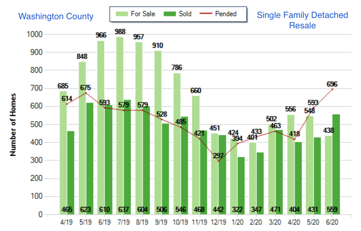
This simple chart gives us a bundle of critical insights into the state of the market.
Supply: The light green bars give us a handle on the number of sellers who are looking to move as of the end of each month. This bar tends to ebb and flow in an annual pattern related to school year, holiday season and weather. Experts look for fluctuations that either amplify or diminish this pattern in order to see the impact of other forces on supply.
Pace of Sale: The dark green bars show us the market’s appetite at current price levels for the type of property under consideration. Note that this bar represents an amount accumulated over the course of a given month, while the light bar represents a fixed amount specific to the end of a given month. It stands to reason that these bars tend toward a seasonal pattern similar to the pattern for supply, as a seller is often a buyer at the same time. An experienced observer will look at the fluctuations that are out of sync with those on the supply side in order to assess the impact of other forces on demand.
Inventory: We get this key indicator by measuring a given month’s light green bar against its dark green bar. An economist might characterize inventory as “months to full consumption” which effectively translates as an answer to “if nothing new comes available and the current pace of sale is maintained, how long would it take to sell everything on the market?” As a rule of thumb, the balance point between a buyer’s market and a seller’s market is 6 months of inventory. That is to say, 6 months of inventory puts buyers and sellers on equal footing where negotiating strength is concerned. In the context of this chart, a balanced market would feature light green bars six times the height of the corresponding dark green bars. Because inventory has stayed well beneath the 6-month level for the entirety of the 15 months under study, we infer that sellers have been playing an extremely strong advantage and that prices will have escalated as a result.
Trajectory: The red line enters our thinking here, as it gives us a look at the properties that are in transition from available to sold for a peek into the future. Because most real estate transactions require 30-60 days for contingencies to be cleared, we expect the red line for pending sales to be roughly tracked by the dark green bars in the following one to two months. That is largely the case for the period under study, with the spike in May and June predicting additional compression coming down the pipeline.
Summary: This market segment has undergone 15 months of supply shortage. The year-over-year comparisons of second-quarter inventory and a look at the current spike in pending sales indicate an intensification of this imbalance with no relief on the horizon. This serves both to explain price escalation and predict more of it. In a nutshell, Sellers are playing an advantage of historically mighty proportions.
THE LITTLE PICTURE
Now that we know the conditions of the pond in which we’re floating, we need to study our boat!
A single-story home with three bedrooms and two bathrooms comprising 1,800 square feet built in 1990 on a 6,000 square foot lot should give us a good field for comparison.
Our objective here is to set an expectation for average value as a benchmark against which to position the subject property – A purpose for which regression analysis is heroic. To turn it into a little picture, we distill our sample set with additional qualifiers, spread it across a scattergram and run a regression line through it. We’ll use the current year’s activity and go with Levels (1), Lot Size (5,000 sf – 7,000 sf), and Year Built (1985-1995) as our additional qualifiers [note that we could further distill with additional parameters (such as zip-code or neighborhood) and/or tighter parameters (such as lot size from 5,500 sf – 6,500 sf or year built 1988 -1992) adding precision but reducing the comparison points]. We’ll show the success stories (sold properties) as blue dots, the competing alternatives (available properties) as green triangles and the properties in between these extremes (pending properties) as yellow diamonds. Spilling all three over a graph with price as the vertical axis and square footage as the horizontal axis, running regression lines for the sold & pending properties and pegging the subject property’s square footage…we get this:
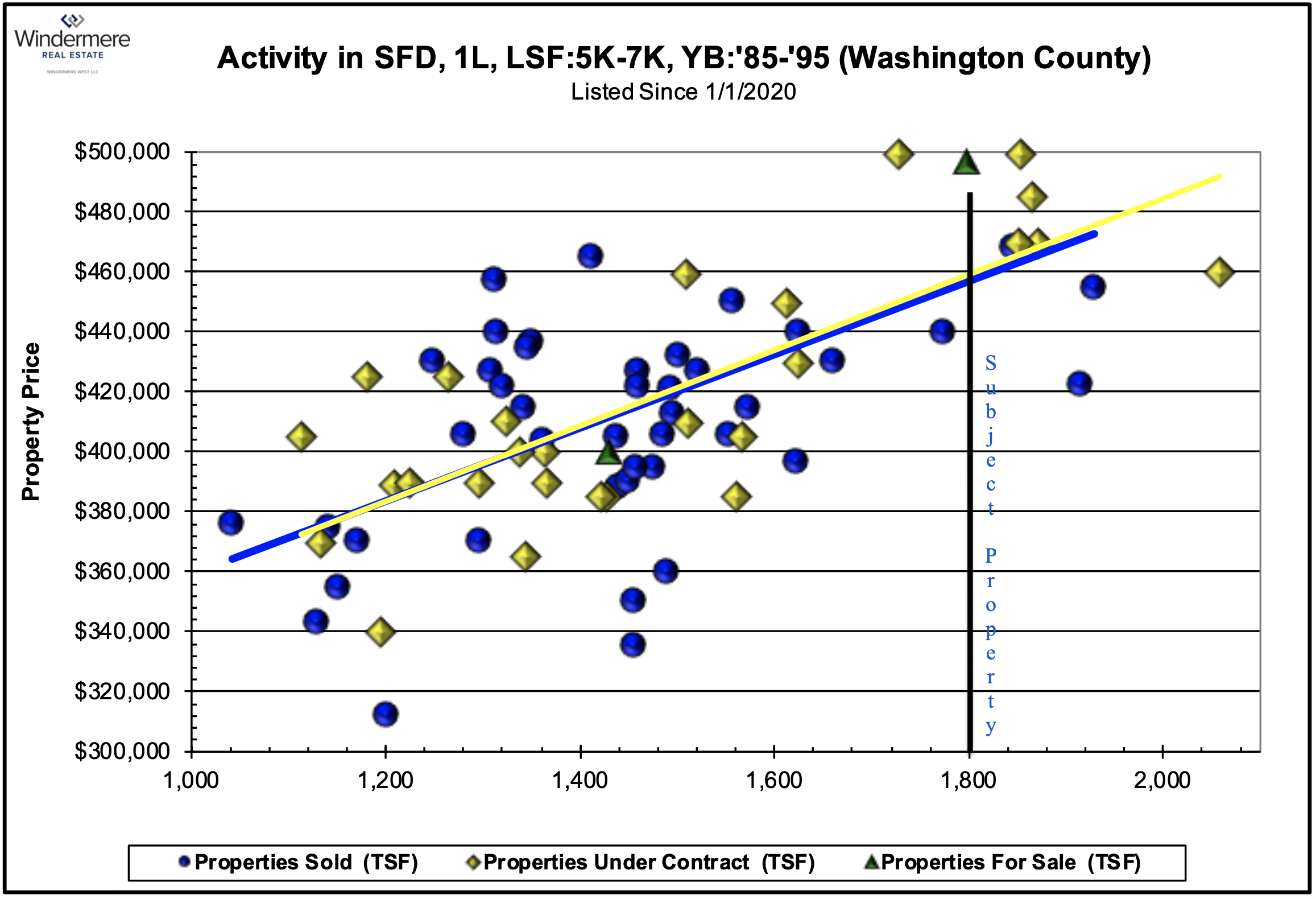
AHHHH…What a thing of beauty! We can see so much within this picture –
Slope: The relationship between square footage and price is represented here by the slope of the regression lines. The first test of validity is to be sure the line runs upward from left to right (that is, there should always be a positive correlation between square footage and price). Steeper lines indicate value more tightly associated with dwelling size, and is often the case with condominiums, townhomes and planned unit developments where all other things are closer to equal. Flatter lines can indicate widely disparate sample sets with ulterior considerations such as views, proximity to amenities or architecture.
Dispersion: The more widely scattered above & below the line, the less uniform the properties are likely to be. It’s not surprising at all to see a fair measure of spread when looking at this set, whose constituents are drawn from across a full county and have had 25-35 years to grow apart in terms of condition. At the other extreme, a newly developed neighborhood with design uniformity and little variation in terms of proximity to amenities should feature constituents placed very tightly alongside and on the line.
Trend: In a market whose big picture articulates low inventory and predicts price escalation, we expect to see signs of both in the little picture. In this case, our sample set has only two active listings (validating our expectation for low inventory) with enough closed and pending sales to produce a really nice regression line for both. Because the closed sales are accumulated over 6 months’ time, while the pending sales are current, we validate our expectation for price escalation by looking for the regression line for pending sales (yellow) to be nudging upwards from the regression line for closed sales (blue). Bingo!
Position: The crown-jewel of this analysis is the intersection between the subject property’s square footage and the regression line for sold properties. In simple terms, this is the point at which we would expect a meeting of the minds on a perfectly average transaction – A perfectly average buyer and a perfectly average seller exchanging a perfectly average property under perfectly average conditions.
The artistry lies in identifying the subject’s position relative to “average” – Skillful selection and detailed evaluation of the most relevant sales, pending sales and competing alternatives allows for a frank assessment of where a seller should expect to fall along the vertical line representing the subject’s square footage. In the case shown here, our 1,800 square foot dwelling should be matched for all its pros & cons against the five pending sales between 1,700 and 1,900 square feet (all of which are encouragingly above both regression lines), the two closed sales straddling the lines in that same range and the competing alternative tucked just beneath the $500,000 price point. If a confident conclusion can’t be drawn from those comparisons, one simply widens the size window for additional comparables and/or reconfigures the search parameters back at the drawing board. It’s important here to adopt the implications of the big picture (and their echo in the little picture) where price movement is concerned – An ambitious strategy is appropriate in an escalating market while restraint is required in a descending market.
THE FULL PICTURE
Establishing expectations for value blends science and artistry, but is eminently do-able given the right data, skillset and experience. Studying the trends in the big picture and the intricacies of the little picture empowers a homeowner to work down the line from data to wisdom. We can see from this simple example just how it’s done.
Best of all, we have some extremely interesting and historically exceptional signals to pursue as the future unfolds. Here are just a few:
- How sharply will the acute shortage of recent months (accentuated by a spike in pending sales) boost prices?
- How far will prices escalate before concerns related to viral exposure are subordinated and supply expanded?
- How long will resale properties sustain an extraordinary advantage as new construction arrives to decompress the market?
Stay tuned!


